
By Jim Ross · Builder, Cybertrickz · Last updated June 2026
If you have ever tried to post a wide panorama, a tall infographic, or a piece of grid art to Instagram, you already know the problem: Instagram crops it, squashes it, or refuses the aspect ratio entirely, and the impact you designed for falls apart. An Instagram image splitter solves this by slicing one large image into a set of perfectly aligned tiles that, once posted in order, reassemble into a single seamless image across your profile grid. It is the difference between a flat single post and a banner that spans three columns and stops the scroll. This tool does that splitting entirely in your browser — you choose the image, pick the grid, and download ready-to-post tiles in seconds. Nothing uploads, no account is required, and your image never leaves your machine. The rest of this page explains how it works, where it actually helps, and one platform change from 2025 that most splitter tutorials online still get wrong.
What an Instagram image splitter does, and why it still matters
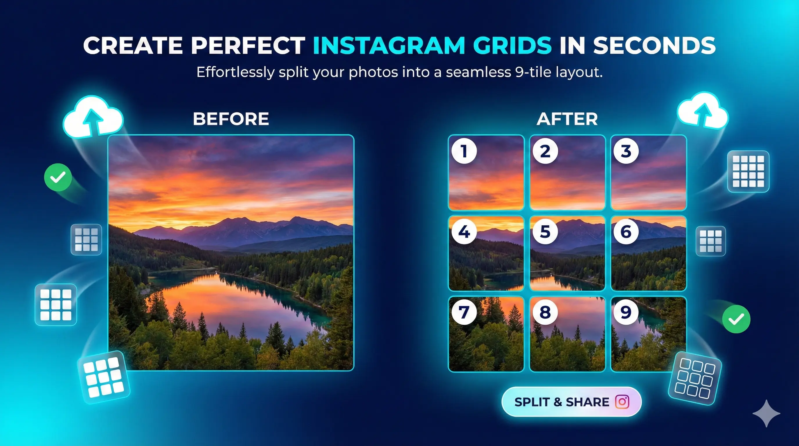
At its core, an Instagram image splitter takes a single image and divides it into equal sections — most commonly a row of three tiles or a full three-by-three grid of nine — so that when you upload each tile as its own post in the correct sequence, they line up edge to edge on your profile. Instagram displays your feed three columns wide, so a row of three tiles forms one continuous horizontal band, and a nine-tile grid forms a large square mural. The technique is used for profile headers, product reveals, announcements, and grid art that turns a profile into a designed canvas rather than a stack of unrelated squares.
Why bother when you could just post one image? Because the grid is the first thing a visitor sees when they land on your profile, and a single image that spans multiple cells reads as intentional, designed, and worth following. It signals effort. The reason a splitter belongs in the browser rather than in an app is the same principle behind every tool on this site: slicing an image is pure client-side math. There is no reason to upload your artwork to someone else’s server, wait for a queue, or hand over an email address to get nine cropped tiles back. The browser already has everything it needs to do the work locally and instantly.
Where the Instagram image splitter actually helps
Take one wide landscape shot and split it into three tiles that form a single banner across the top row of your grid. Ideal for photographers and travel accounts that want a hero image instead of three disconnected squares.
Split a large square design into a nine-tile mural that occupies an entire visible grid. Brands use this for launches and seasonal campaigns where the whole profile becomes one coordinated visual statement.
Slice a wide image into carousel slides so a single graphic pans smoothly as the viewer swipes. A clean way to turn a long infographic or before-and-after into one swipeable story inside a single post.
Tease a product, date, or message across multiple posts that only make sense once they sit together on the grid. The staggered upload itself becomes part of the reveal as the picture completes.
Posters, menus, and infographics are usually too tall for a single feed post. Splitting them vertically lets you preserve the full design across stacked tiles instead of cropping the bottom off.
Designers and event accounts build a coherent wall where related work or moments connect visually, giving a portfolio grid a gallery feel rather than a feed of standalone uploads.
How to split an image for Instagram, step by step
- Choose and load your image. Open the splitter and select the image you want to divide. Use the highest-resolution version you have — Instagram keeps photos at up to 1080 pixels wide and compresses anything larger, so starting big and letting it scale down preserves the most detail. Square or wide source images work best for grid layouts; tall images suit vertical splits.
- Pick your grid layout. Decide how the image should break apart: a single row of three tiles for a banner across the top of your profile, or a full three-by-three grid of nine tiles for a complete mural. The tool divides the image into equal sections based on your choice and shows you exactly where each cut will fall before you commit to anything.
- Preview the alignment. Check the preview to confirm faces, text, and focal points are not landing on a seam between two tiles. This is the step most people skip, and it is the one that separates a clean grid from a broken-looking one. Nudge or re-crop your source if a key element straddles a boundary, then re-split.
- Export the tiles. Download the individual tiles. They save in a clear order — typically left to right, top to bottom — so you know the exact sequence to follow. Keep the files named in that order or note the numbering, because posting them out of sequence is the single most common way grid posts go wrong.
- Upload to Instagram in reverse-completion order. Here is the part that trips everyone up: Instagram stacks new posts in front of old ones, so to make a grid read correctly you upload the tiles in reverse — the piece that should end up bottom-right goes first, and the top-left tile is posted last. Work backwards through your numbered tiles and the finished image assembles itself as you go.
- Check your live grid. Open your profile and confirm the tiles line up as intended. Because Instagram now previews grids as tall 3:4 rectangles rather than perfect squares (more on that below), it is worth a final look on an actual phone to make sure nothing important got trimmed at the new crop lines.
Source: Instagram’s own Help Center confirms photos are stored at a maximum width of 1080 pixels and that the feed supports aspect ratios up to 3:4; the shift of profile grid previews from 1:1 squares to 3:4 rectangles was announced by Instagram in 2025.
Preview Your Grid
Post these images in numerical order (1 → 2 → 3…) for the perfect Instagram grid.
Frequently asked questions
Yes, completely free with no limits, no account, and no watermark. There is no premium tier, no credit system, and no email gate before you can download your tiles. The tool runs entirely in your browser, which means it costs almost nothing to operate, so there is no reason to charge for it. You can split as many images into as many grids as you like, as often as you want, without ever signing up or hitting a usage cap.
No. Every part of the splitting process happens locally inside your browser, so your image is never sent anywhere. You can verify this yourself: open your browser’s network inspector before you split an image and watch the outbound request count stay at zero. This is a structural guarantee rather than a privacy promise — because the tool has no server component, it has no mechanism to transmit your files, which matters when you are working with unreleased designs or client work.
The most common layouts are a single row of three tiles, which forms a banner across the top of your profile, and a full three-by-three grid of nine tiles, which fills an entire visible grid as one mural. Because Instagram is always three columns wide, grids are built in multiples of three across. You can also split images into taller arrangements for vertical content. Pick the layout that matches your source image’s shape to avoid awkward cropping at the seams.
They will if you upload them in reverse. Instagram places each new post in front of the previous one, so the tile that belongs in the bottom-right corner must be posted first, and the top-left tile must be posted last. The splitter exports tiles in a clear left-to-right, top-to-bottom order, so you simply work backwards through that sequence when uploading. Posting in the wrong order is the single most common reason a grid ends up scrambled rather than seamless.
Yes, but it changes how you should plan. In 2025 Instagram shifted profile grid previews from 1:1 squares to taller 3:4 rectangles, so a grid built purely for square cells may now show slightly more vertical area in the preview. The tiles still line up, but keep important elements away from the top and bottom edges of each cell so nothing critical sits where the new crop falls. Always check the finished grid on a real phone, since the feed view and the grid preview can crop differently.
Start with the highest resolution you have. Instagram keeps photos at up to 1080 pixels wide and compresses anything larger, so a big source image splits into sharper tiles. Use JPEG for photographs, where it compresses efficiently, and PNG for graphics with text or transparency, where edge quality matters. Avoid splitting an image that is already small and low-resolution, because dividing it spreads those limited pixels across multiple tiles and the loss of detail becomes obvious once posted.
Split your wide panorama into a row of three tiles, then upload them in reverse order so they reassemble left to right across the top row of your grid. The key is consistency: do not post unrelated images in between, or the band will break apart as new posts push the tiles out of alignment. Many creators dedicate a fresh row to a panorama and plan the following posts around keeping that band intact for as long as it stays relevant.
Yes. Splitting a wide image into equal vertical slices and adding them to a single carousel post creates a panning effect as the viewer swipes through. Unlike a grid, a carousel lives inside one post, so it stays together permanently and is not affected by later uploads. Lock every slide to the same aspect ratio so the swipe feels continuous rather than jumping. This is a reliable way to present a long infographic, a wide landscape, or a before-and-after comparison.
The split itself does not degrade quality — each tile is a clean crop of your original at full resolution. Any loss happens on Instagram’s side when it compresses uploads, which it does to every image regardless of whether it was split. To minimise this, start with a high-resolution source and export tiles that are at least 1080 pixels on their shortest relevant side. Splitting a small image is what causes visible quality problems, because the limited detail gets divided across several tiles.
Yes. The splitter runs in any modern mobile or desktop browser, which is convenient because Instagram itself is a mobile-first platform. You can split an image on your phone, save the tiles to your camera roll, and post them without ever touching a computer. On desktop you get a larger preview, which makes it easier to check seam alignment on detailed designs. Either way the processing is local to the device you are using, so nothing is uploaded from your phone or your laptop.
Building out your whole posting workflow?
Pair the splitter with the tools creators reach for next — captions and threads.
Most “Instagram grid” tutorials are quietly outdated: the profile grid stopped being square in 2025.
Instagram moved grid previews from 1:1 to 3:4 rectangles. If your splitter workflow still plans for perfect squares, your top and bottom edges are getting cropped — and you can’t see it from the feed view.